Every fashion week, a few colors crop up among all the big name designer collections. This spring, that elite group of hues included nectarine, poppy red and bright yellow. You'll see these colors all over clothing stores, but you can also apply the fresh pigment to your home. Here are some ways of incorporating the fiery colors in your interior design.
Nectarine
What rhymes with orange? Luckily, decorating with the color is easier than rhyming with it. Citrus may clash with a lot of other hues, but, paired with the right accents, it can invigorate a room. Better Homes and Gardens recently�put together a collection of the best looking rooms that feature orange. In the spread, a lively take on the classic dining room pairs�chairs with bright nectarine cushions in�natural materials, white walls and yellow flowers in shades of varying oranges. The lesson here is to let the color stand on its own and keep the other fixtures in the room quiet. White walls keep the room looking clean, and the wooden table and floors add texture without competing with the orange. Bright yellow buds bring some variety to the space and lend some interest. Rather than flowers, you can�use your window treatments as an accent - one that you don't have to water. Cellular shades in golden leaf would have the same effect in this room as a subtle bridge between the nectarine and the white.
Poppy red
Rather than featuring this daring color on large fixtures, focus it on the accent. The pigment itself is brought to the forefront of the room on its own in small doses. HGTV pictures a kitchen with white and black fixtures, forest green backsplash tiles and poppy-colored chandeliers and chairs. The pieces that you choose to be red should either be small, or should only have the shade on one part. This sort of restraint keeps the room from being overpowered by color, and the use of red in more than one place takes the eye across the room, rather than arresting your attention. The accent in the room shouldn't be an equally bright color, but one that blends into the neutral colors seamlessly while still adding depth.�When using such an exciting color, details should be kept to a minimum elsewhere. This is achieved with white roman shades, clean-looking tiles, solid colors and sparing use of nonessential decor. Throw a bit of poppy red into an already black-and-white room by painting the legs of tables or hanging a stand-out piece of art that uses the pigment.�
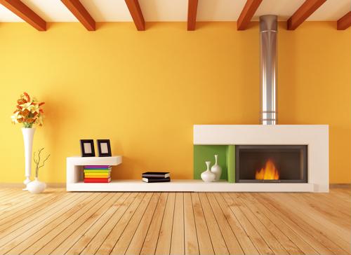
Lemon zest
Although�yellow packs a punch equal to that of nectarine and poppy red, the hue can easily be used from ceiling to floor. Red and orange can make people feel passionate and overexcited, but lemon zest evokes a pleasant feeling of cheerfulness. Throw restraint out the window when decorating with this shade. Paint your walls the bright yellow pigment of your choosing, and choose a few other lemon-colored pieces like throw pillows, cellular shades and floral arrangements. Decorate the rest of the room in shades of grey and beige and an accent color like robin's egg blue or fern green. The advantage of yellow is that it's not as jarring as red or orange, and can be matched with a�wider range of hues. In order to retain�the full impact of the color and keep your room from looking busy, stick to one accent color and try to keep the other colors consistent (only shades of grey or beige).